These are my final images from the Street assignment. I decided to shoot images of my friend playing guitar. I love these images and I am very proud of how they have come out. The images show a lonliness because he is on his own and there is nothing going on in the background.
My favourite image is the middle image because the way I have manipulated it looks like an old style photograph.
I really enjoyed this talk because I found it relevant to me at the time because we were doing the "Making a book" assignment and for the assignment I am doing my book about portraiture. His biggest work were group projects he did. Although I don't really find his photographs that interesting I still appreciate that he took the time to come and speak to us and I also like his ideas for shoots.
After researching Julian Germain I found he did a portrait project about generation this influenced my ideas for my own portrait project.
Studio Output are a team of artist working in every medium. Based within two studios in London and Nottingham.
They work doing websites, Advertising and Editorials. They have worked for such clients as Radio 1, Gio-Goi and Playstation to name a few.
I find their work very influecial and interesting to look at. I think they give an effective outlook on advertising leaving the viewer captured to the designs they have.
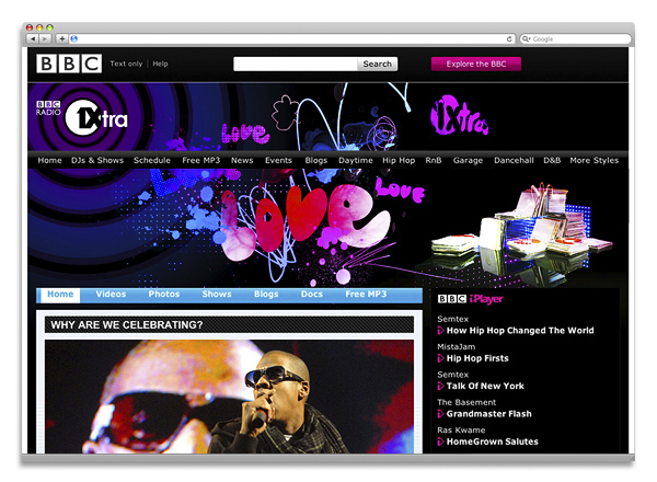
The images bellow are from the Radio 1xtra launch campaign. I love the clours withing the images.
The class was given a day task to create interesting image using our bodies. We had to work in groups and half the group were the models and the other half were the photographers. i worked as one of the photographers for this task.
We walked around Burton finding interesting places to shoot our one minuite sculpture. We used placed such as phone boxes, doorways and passage ways etc...
I really enjoyed this talk. Daniel Stier was a very friendly man. He seemed nervous at the start but I couldn't blame his as he was standing in front of a lot of teenage faces. Once he got talking about his career and images he seemed to loosen up.
I found his photographs really interesting.
As well as being a renowned advertising photographer he has also taken portraits for various famous people such as Boy George,Helen Mirren and Amy Winehouse to name a few.
He has also done editorials for various magazines such as British Vogue, Dazed and GQ.
Daniel Stier showed us many of his photographs.
Whithin Stier's talk he told us he worked on the Sonia Bravia advert which interested me because thats the line of work I want to go into. The image below is a photograph Stier took for Sony.
The video below is the vinished Sony advert. Stier told us about how they managed to create the advert. He said they had to keep moving the clay bunnies an inch every shot which made me realise the lengths you have to go through to create a knock out advert that will make people interested in the product.
As we are currently working on a street photography assignment I found Ed Swinden's talk relevant and interesting.
I didn't really get any inspiration from him though which I was disapointed about after a really inspirational talk from Jon Burgerman.
Swinden focused mainly on his street photography work. He told us about how he would wait for ages to get the right sunlight and setting to produce his images that were shot in Manchester
Whilst giving his talk Swindon seemed very nervous and the talk seemed really rushed through.
The Video above is Jon Burgerman at AOL headquaters in America.
John Burgerman came into college on October 6th to give us a talk. I found his talk very interesting and inspirational. Jon Burgerman studied graphic design at university. I like his work because it is bright and fun to look at.Whilst Jon Burgerman was giving his talk he expressed hiself very well and he was excentric about his work. He was also very friendly and funny and he wore a "Burger man" jumper.After he had visited my college assignments started influenced by Jon Burgerman's style of doodles/cartoons.The Graphic design class began to draw on their classroom white board in the same style as Jon Burgerman.
The image below is an example of Jon Burgerman's work as you can see there is alont to look at within the image and I like that.
In week two we were given a day assignment to go to somehwere in Burton that we hadnt been before and take a picture of an object with someones body part in the image too.
I found the assignment a little hard as I couldnt think of an interesting object to photograph but after some thought I decided to use my jewlery that I wear everyday.
I placed my Jewlery onto a bollard and I used my friend Vikki's legs to be in the image as the body part.
I edited my image in only one way - cropping. I cropped my image into a square because I felt the image looked better that way.
I think I could have done more to establish a good effective idea and I feel if the assignment was longer I would have deffinately come up with more ideas and done alot more research.
When I first recieved the assignment brief I thought "wow! this is going to be hard!" but after I had thought about it I realised that the assignment was a great chance for me to be creative and produce effective images.
I feel like I could have produced more effective images if the assignment had been longer that two days.
I really enjoyed viewing all of my classmates images and seeing how creative everyone were with their ideas.
The feedback I have had on my images has been positive.I really enjoyed this assignment and if I had to do it again I would have done more research and tried to create more effective images.
All in all I am happy with the outcome of this assignment.
This is my favourite image from my three final images because I think it is the most interesting. I shot this image in the studio on the worktop. I placed the cups in various random places and I feel the set out of the image is very interesting, also the mirror adds to the effect.
I like this image because of the repitition of it. I think the cups add an effect to the image and also the curve in the heater adds to it. I produced this image when I was walking around college trying to find an interesting place to take a good effective image. I believe the cups break up the image because of the colours included in the cups.
I like this image because the cups remind me of flower pots which links in with the backdrop of the image which shows a flower bed. I feel the colours in the image match and go nicely together. Most of the colours in the image a nuetral but the flowers stand out as they are bright orange. I think after some editing this image will look better


 The class was given a day task to create interesting image using our bodies. We had to work in groups and half the group were the models and the other half were the photographers. i worked as one of the photographers for this task.
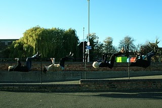


 As we are currently working on a street photography assignment I found Ed Swinden's talk relevant and interesting.


